Creating a Global Home with 2018's Colors of the Year
Three of the biggest names in color have announced their picks for 2018 and they’re giving us serious wanderlust. This year, PANTONE, Sherwin-Williams, and Benjamin Moore seem to take out their maps to pinpoint their predictions for the most impactful colors of this year. These colors bring the vitality of Earth’s most inspiring destinations to us - no passport required! We can’t wait to see where they’ll take us.
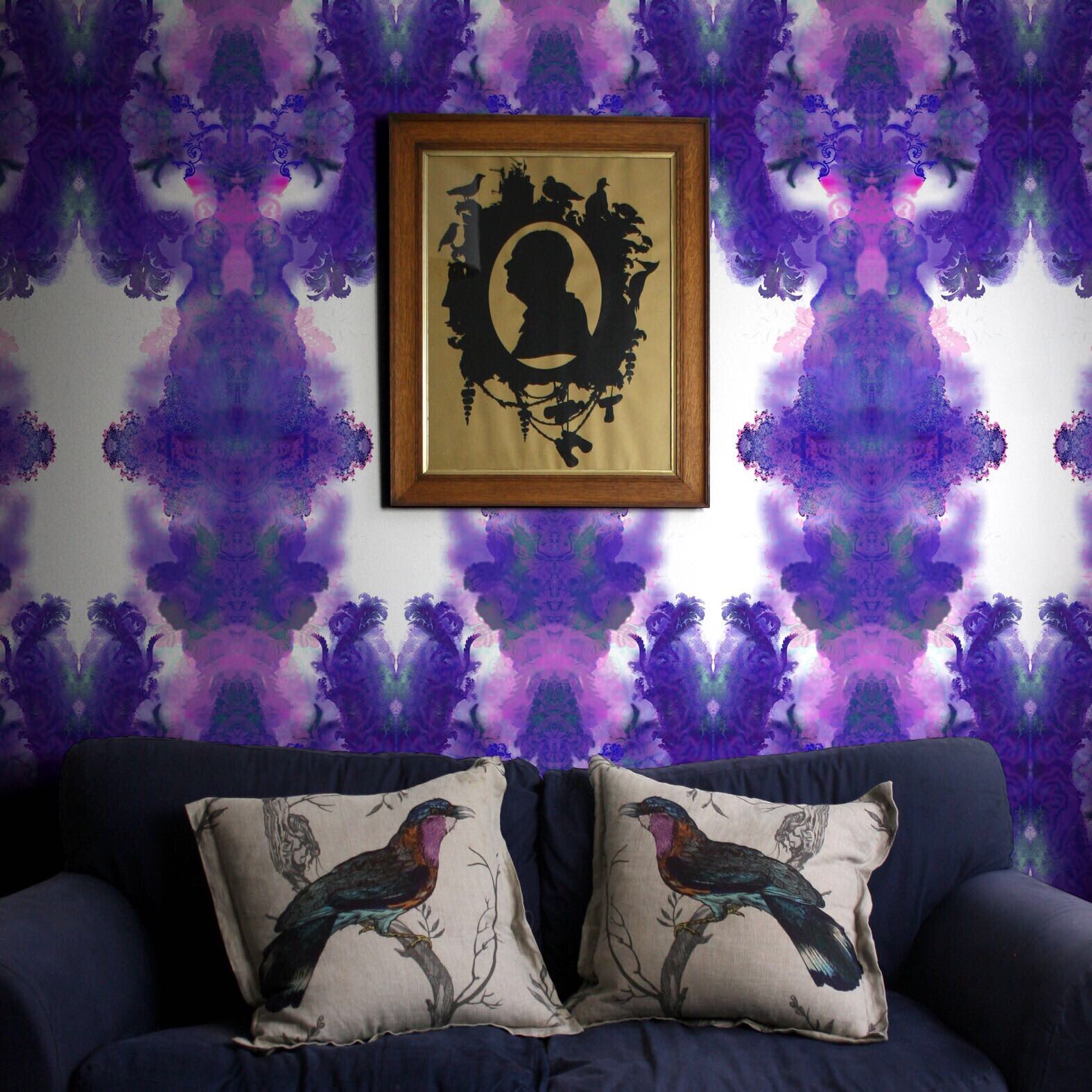
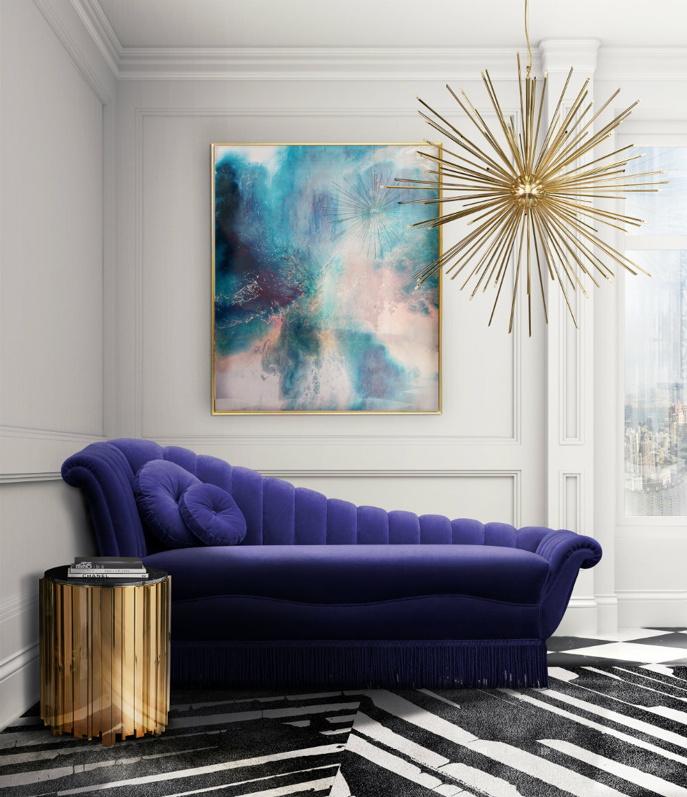
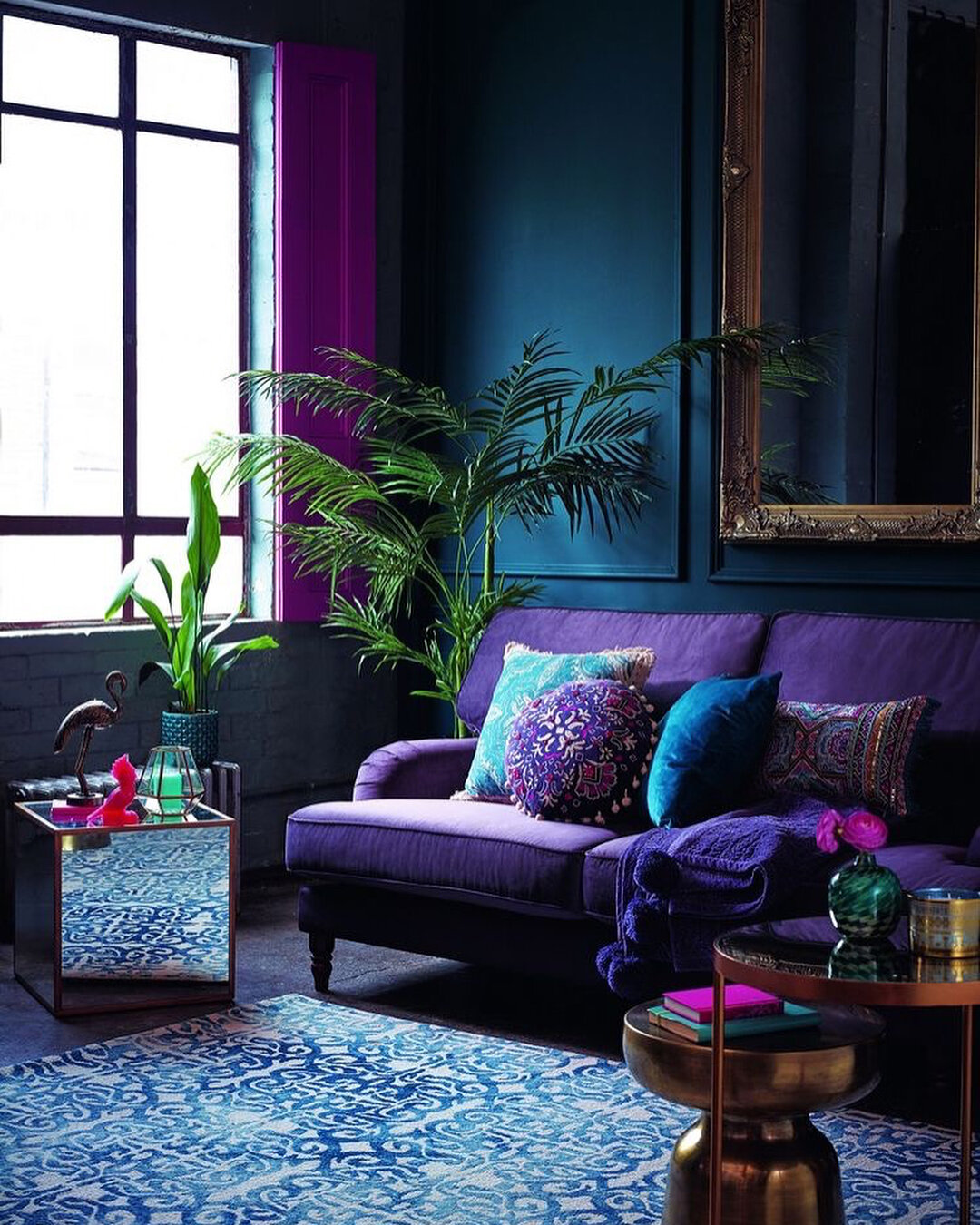
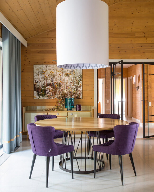
PANTONE - 18-3838 Ultra Violet
Pantone’s selection is perhaps the most unexpected. The dynamic and deeply mysterious 18 - 3838 Ultra Violet is full of curiosity and reflection. Ultra Violet is an expansive, complex color. It has historically been used in meditative and spiritual practices for its ethereal qualities and inextricable link to the unknown. Its depth and individuality reminds us of those same qualities in outer space and in our galaxy. PANTONE’s selection references the grandeur of our universe and the magnitude of future possibilities it contains within our atmosphere and beyond. If there was a passport stamp for outer space, I have no doubt it would be Ultra Violet in color.
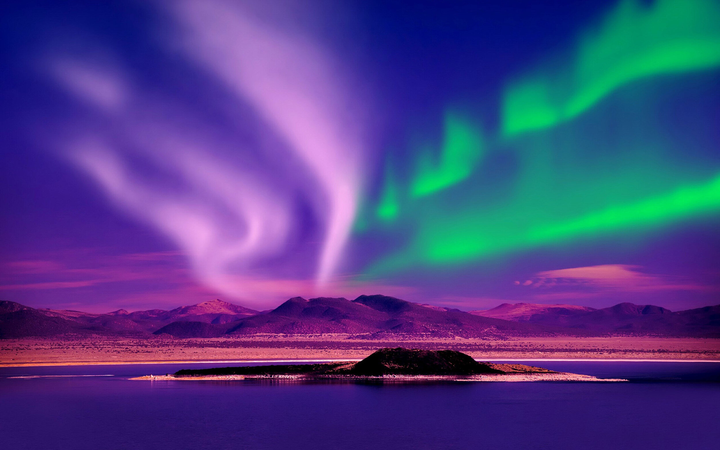
From the Northern Lights in the Arctic Circle to the textiles of indigenous cultures in the Andes mountains of South America, Ultra Violet somehow manages to encompass an unquantifiable breadth of natural and cultural phenomena that are nothing short of “Wow!”.
It channels the unpredictability and unconventionality of creative vision and the genius of icons like David Bowie and Andy Warhol and the individuality that they embody. It is the swirls of light and color we see when we close our eyes and the pop of exciting color that stimulates our senses wherever it is used. This blue-purple hue is packed with pigment and is a forward-thinking choice that we hope will inspire a trend in further exploration of bold color applications in interior design and beyond. This shade is perfect for the dreamer in all of us, and PANTONE’s boldness in it’s selection is nothing short of profound.
TRAVEL THE WORLD WITH 2018’s COLROS OF THE YEAR
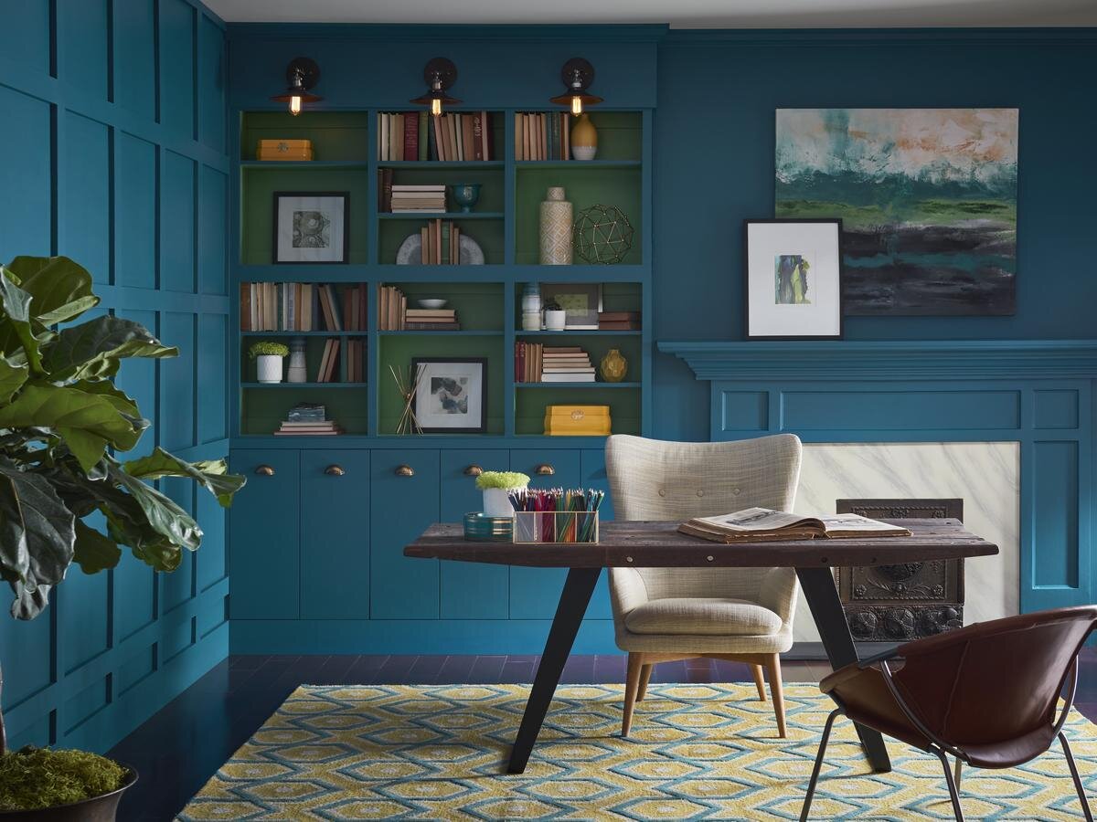
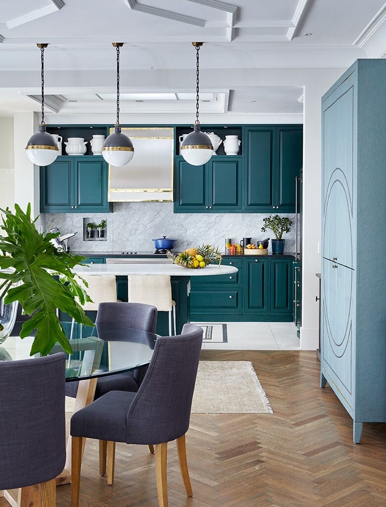
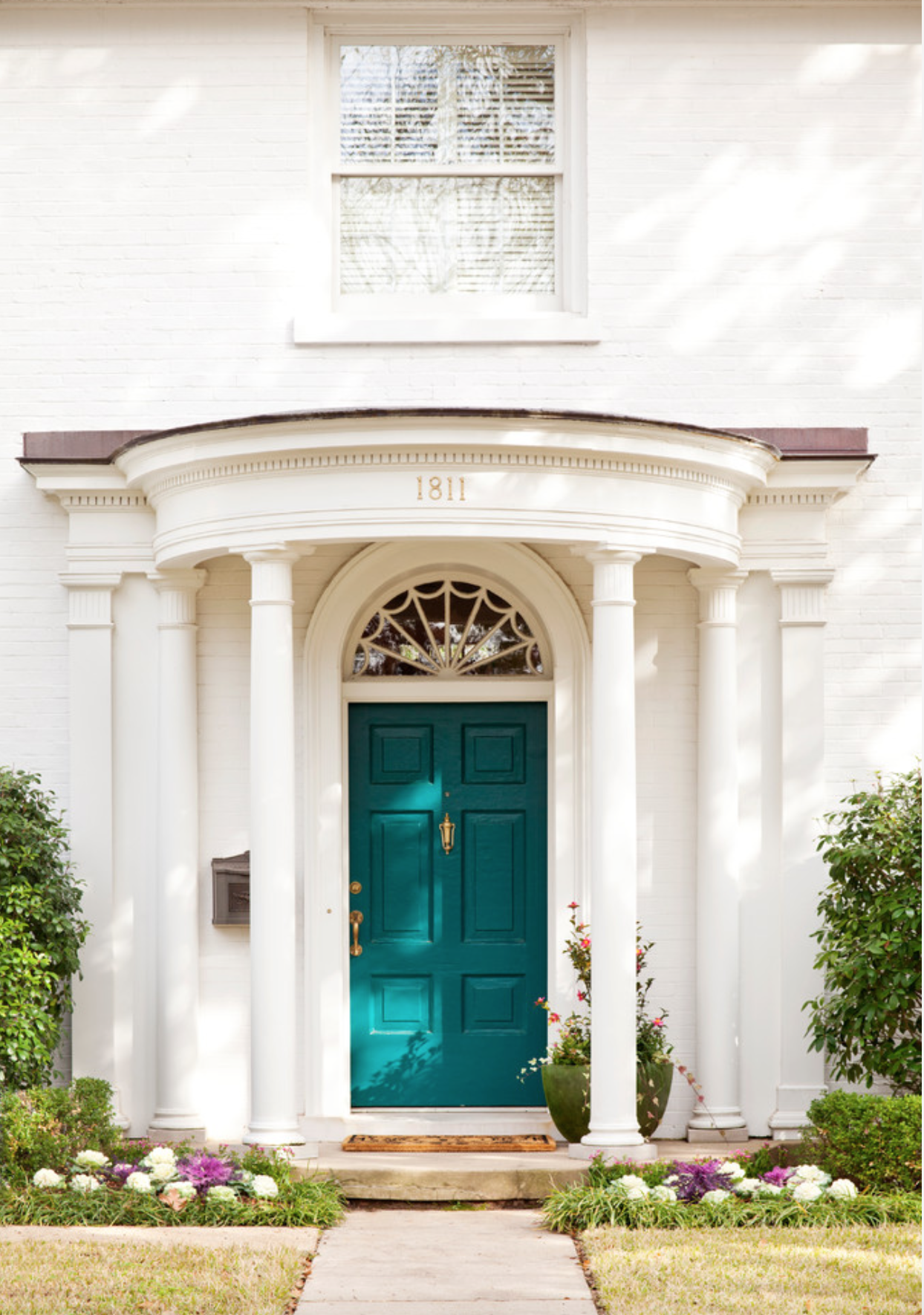
Sherwin-Williams - “Oceanside” SW 6496
“Oceanside” is Sherwin-Williams adventurous choice that captures both the serenity and boldness of the sea. It is both elegant and outgoing, and if it doesn’t have you planning your next vacation to the Amalfi coast, it will certainly contribute a confident and carefree new personality to any of your spaces. “Oceanside” will quickly take you from the familiar cool blues of the Gulf of Mexico across the pond to the vibrant and exotic Mediterranean Sea. This adventurous color abandons the notion that blue should be calming and dependable. Instead, “Oceanside” invites us to come aboard into a youthful world of wonderment where sirens sing and the wind is always in our sails. Whisk your home away from traditional neutral color schemes and add in the history of Greece, the flavors of Italy, or the sounds of the Pacific Islands.
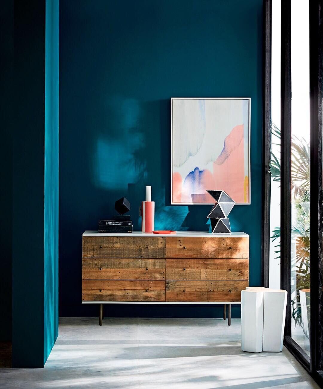

This moodier take on a traditionally safe color palette is an invigorating new consideration for the applications of color in design. There is no limit to the refinement that this color can impart to your space, whether it be sophistication, relaxation, or recreation that you seek - “Oceanside” delivers a destination for all. You don’t have to be a trendsetter or a designer to love this color - its soulful character pairs well with just about anything, giving YOU the opportunity to explore your own design interests for a look that is one hundred percent you. The alluring blue-green hue is begging all of us to be more courageous in our daily lives and to embrace our playful sides for that beauty-keen attitude, year-round.
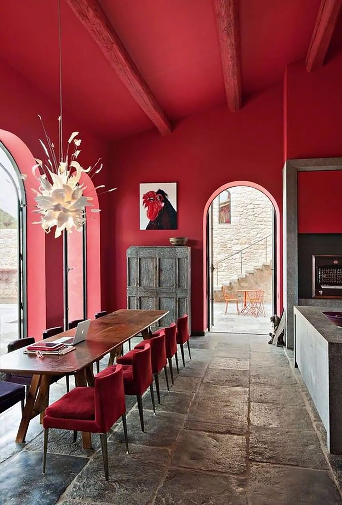
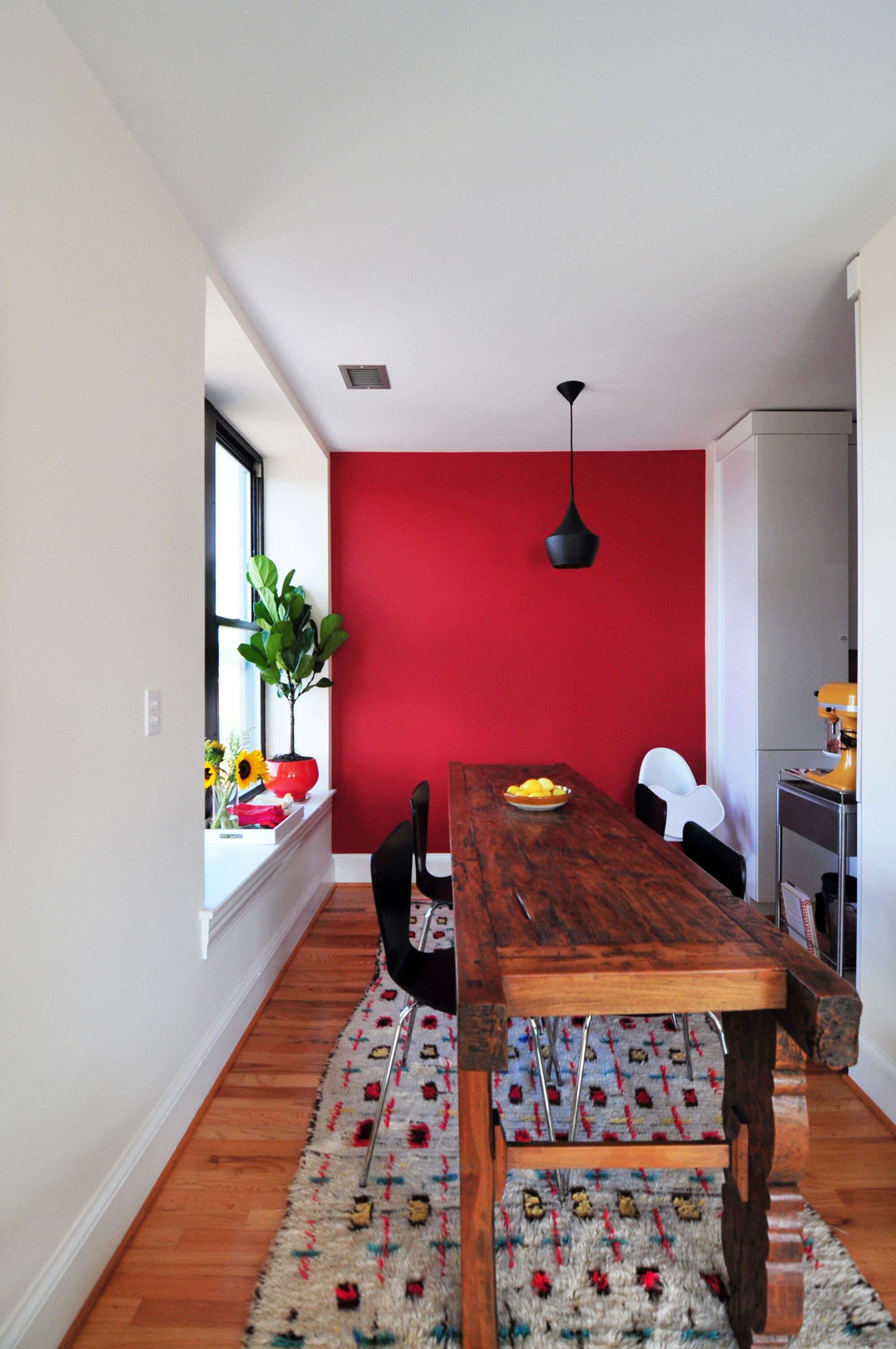
Benjamin Moore - “Caliente” AF-290
“Caliente” is a sensual red that packs a powerful punch no matter where it is used. Benjamin Moore harnesses the vitality of Latin cultures and the flavors of East Asia for a daring color sure to enliven even the most bland spaces. “Caliente” creates a space the feels like Flamenco sounds - lively, seductive, and alert. The energy of this orangey-red can invigorate cool grays and blacks or enhance the richness of warm wood tones. Pair it with simple forms and modern lines for a Scandinavian feel, or use it to highlight the beauty of collectibles and antiques to elevate the status of your most beloved possessions.
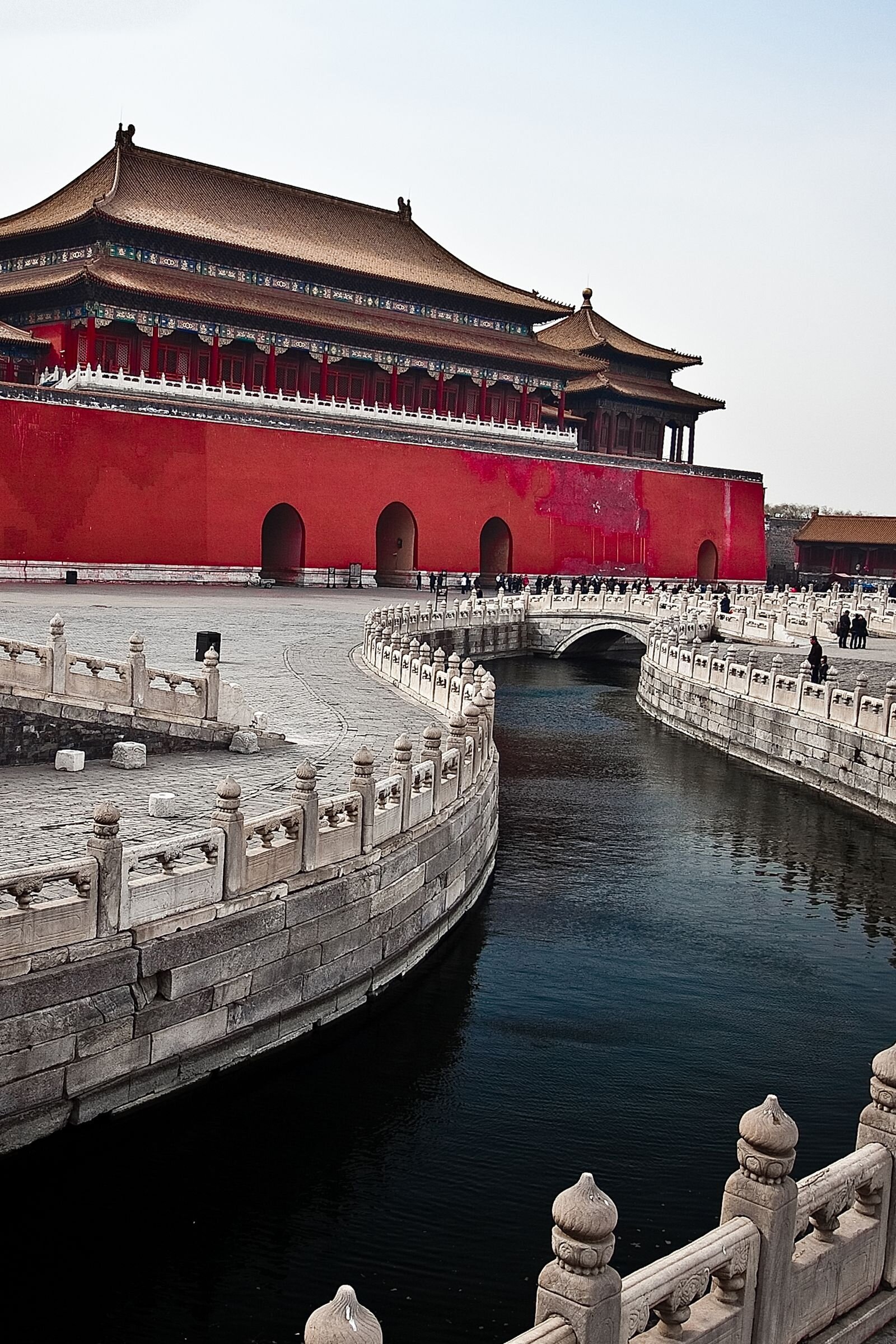
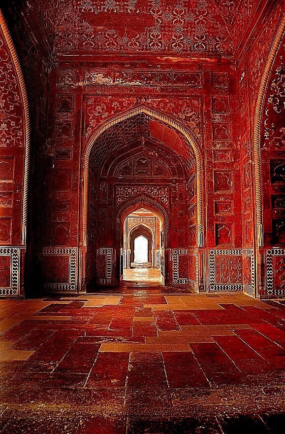
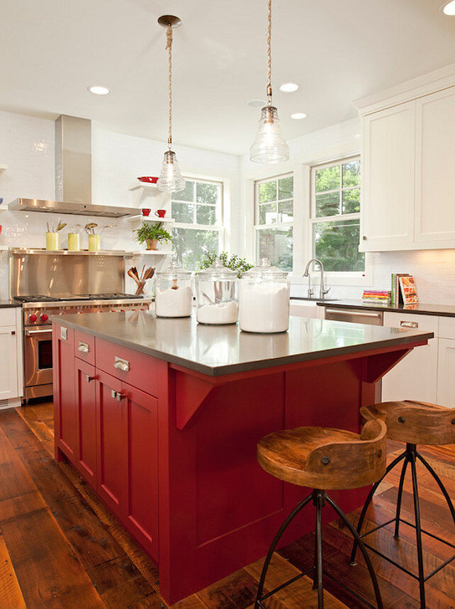
This beautiful color evokes confidence and inspires bold choices beyond color selection. Historically, red signifies power. Today, it empowers women in the form of MAC’s Ruby Woo lipstick, it epitomizes luxury through brands like Christian Louboutin and Ferrari, and it fills plates and stomachs with classic dishes like spaghetti bolognese. With an arsenal as dynamic as this, “Caliente” is sure to elevate any space for any purpose. Feel leisurely - take your dining room to the streets of Madrid and enjoy an aromatic meal of paella and red wine. Draw inspiration for your exterior from the expansive courtyards of Dynastic China, where palace’s red columns tower above, creating a sense of reverence and majesty. Utilize the pop that “Caliente” provides to highlight the bold patterns and artistry of Moroccan tiles and textiles for a bohemian atmosphere. Stimulate your senses and add energy to your kitchen with the diversity of Indian food markets - cumin, basil, turmeric, black pepper, curry, ginger - because spice doesn’t just belong in our food! No matter your taste, Benjamin Moore’s 2018 pick is sure to spice up your life.


Share the love!